Cover story

Earlier this week I picked up The Distant Hours by Kate Morton. I purchased the book almost a year ago but never started it. Back when I first became the used book buyer for our bookstore, I wanted to buy every book that came across the desk for myself. I forced myself to leave some books for the store and only bought ones I was already interested in reading. I’m an excellent penny pincher so it wasn’t too difficult limit my personal purchases. Every once in a while I would hug a book gently before stickering and shelving it, but I always let them go.
 The Distant Hours was different. The cover grabbed my attention and pulled me into its world. The castle overlooking the moors with a blue-gray sky above told the story of the book as well as the liner notes. A letter sent fifty years ago finds its way into the hands of our main character Edie. Edie follows the letter’s path to the decaying Milderhurst Castle. There she meets three aging sister who helped Edie’s mother during World War II. The castle and the sister have secrets that Edie slowly discovers during her visits, unraveling her mother’s story among others in this gothic fiction.
I fell in love. I rarely judge a book by its cover, but really, that is what the covers are for. The art can pull you in as much as the description of the story, and it’s the first thing you see when picking up a new book. At the AWP conference I attended a talk about small presses and one of the authors said her favorite part of publishing with a small press was the control she had over the cover art. Her book was about a college-age woman who moved back to her hometown. It’s a coming-of-age novel and with a female protagonist it will appeal mostly to women. But the author wanted to at least try to get a few men to pick up the book. She had experience with large presses and knew they would put a close-up of a woman on the cover, probably with an out-of-focus field in the background and just as likely with her face out of the frame. That way all the women looking to buy the book will put themselves in the heroine’s place. The same effect is achieved when publishers put figures, usually women, walking away from the camera toward the sunset, or a beach, or that same out-of-focus field.
The author wanted something that would appeal to both genders instead of being pigeonholed into “chick lit.” I understand completely. Female torsos or backs are as prevalent in “books for girls” as guns and submarines are on “books for boys.” While the cover for The Distant Hours is beautiful, it’s a dark beauty and not necessarily feminine. The castle is on a hill that borders on being a cliff. The water below is filled with rocks; the clouds are coming in to cover the pale blue sky. This place holds secrets and might not be ready to let them go. Of course I had to buy it.
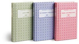
 I hadn’t thought to pick it up again until this week because this is the week I finally bought myself a copy of Wuthering Heights. I went to a library sale and picked up a bunch of classics and history books to sell to the store so I could get myself some store credit and buy the cutest set of Gramercy Classics that came in a few days earlier. Among the books I sold for credit were two copies of Wuthering Heights. I sold a different copy of the same story I would be buying, and paying more money for, all because of the cover. The rest of the set includes Jane Eyre, Great Expectations, and Pride and Prejudice. The books I was selling from the library also included Jane Eyre and Pride and Prejudice, books I already own in different editions but wanted to buy again because they were little with matching covers and ribbon bookmarks. I’m a sucker for ribbon bookmarks. They feel so damn classy.
Covers are important, if only because they make people like me buy multiple copies of a good book because the new cover grabs my attention. I know Kate Morton really wants me to read her book, not just to buy it and then admire the pretty artwork. But the artwork is what got me to open the book in the first place, so no matter the quality of the book, the art deserves an honorable mention. Because it was so appealing I bought it and now I’ve finally started it. I’ll finish it this week while my Gramercy Classics set looks down on my from its prime spot at the top of my bookshelf.
—
Kelly Hannon works in an indie bookstore, is editing her first novel, and blogs about annoying people at www.letterstopeopleihate.com. Follow her on Twitter @KellyMHannon